

SUBSCRIBE TO OUR FREE NEWSLETTER
Daily news & progressive opinion—funded by the people, not the corporations—delivered straight to your inbox.
5
#000000
#FFFFFF
To donate by check, phone, or other method, see our More Ways to Give page.
“There are three kinds of lies,” Mark Twain once said, “lies, damned lies, and statistics.” Today, there’s a fourth kind: pie charts.
A network of billionaire-funded propaganda organs has labored for decades to convince the public, politicians, and the media that Social Security and Medicare are financially unsustainable and must be slashed. These outfits are skilled at the art of number manipulation—so much so that this idea became inherited political wisdom for both parties.
Their cause has become less popular in recent years, but the mighty machine isn’t backing down. House Republicans are calling for another closed-door commission to explore cuts. “Liberal” newspapers still promote their falsehoods. And the usual suspects in the think-tank industry keep flooding the media zone with scary figures—and even scarier pictures—to frighten the public into submission. Oh, those pictures!
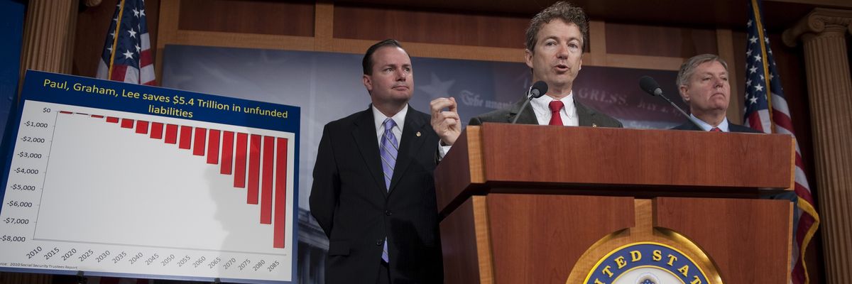
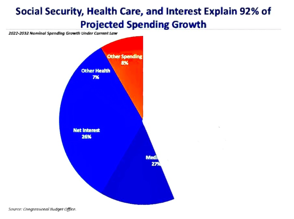
Take this one. It’s from the Committee for a Responsible Federal Budget, created by hedge fund billionaire and Nixon apparatchik Peter G. Peterson:
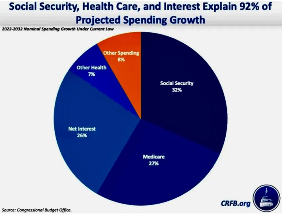
A glance at this chart could almost convince a person that we can’t afford Social Security and Medicare. But, even by the benchmarks of orthodox economics—the lingua franca of the policy class—it is deeply misleading.
First, it’s easy to overlook the fact that this chart doesn’t represent actual spending, but projected spending growth. That tilts the playing field, because Social Security’s actuaries are required to project its cost for decades to come—an exercise that is highly speculative. That’s not done for other kinds of expenditure.
Next, note that interest costs are lumped in with health care and Social Security. Why? There’s no logical reason to associate them, except for shock effect. Social Security never pays interest. It’s required by law to pay benefits from the money in its trust funds. In fact, it has lent trillions of dollars to the overall federal budget. That means some of the interest in this chart is being paid back to Social Security.
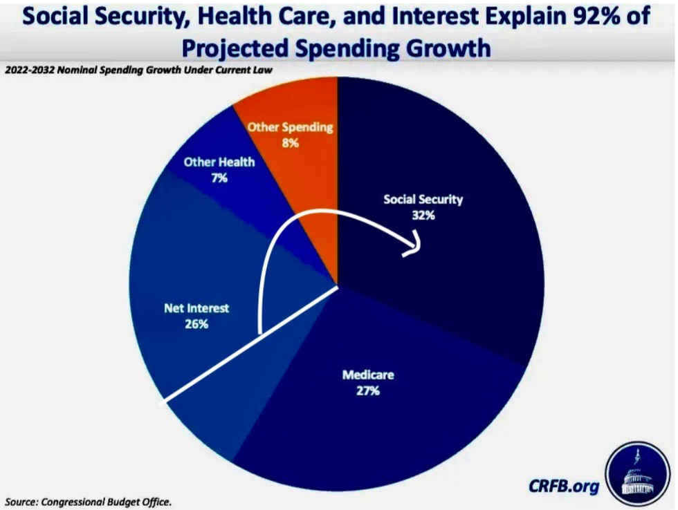
The US Treasury owes 9.2 percent of the federal government’s debt—some $2.8 trillion—to Social Security’s trust funds. The CRFB is double-counting this debt: first, by associating it with Social Security and healthcare, and then by leaving out the fact that this money is owed to Social Security itself. Until that debt is paid off, in the next ten years or so, the chart should look more like this:
They’re leaving out something else: Social Security is fully funded by its own dedicated revenue levied specifically for that purpose. If Social Security didn’t exist, that revenue would not be collected. The inverse is also true: if that revenue wasn’t collected, Social Security would not exist. Importantly, by law, those dedicated revenues can only be spent on Social Security benefits and their related administrative costs. This is not a complicated concept. Even Ronald Reagan tried to clear up the (likely willful) misunderstanding almost four decades ago.
If the chart reflected projected unfunded spending growth—which is the implication behind them, and is what the so-called deficit hawks claim to worry about—Social Security’s projected increase would drop to zero. Then the chart would look something like this:
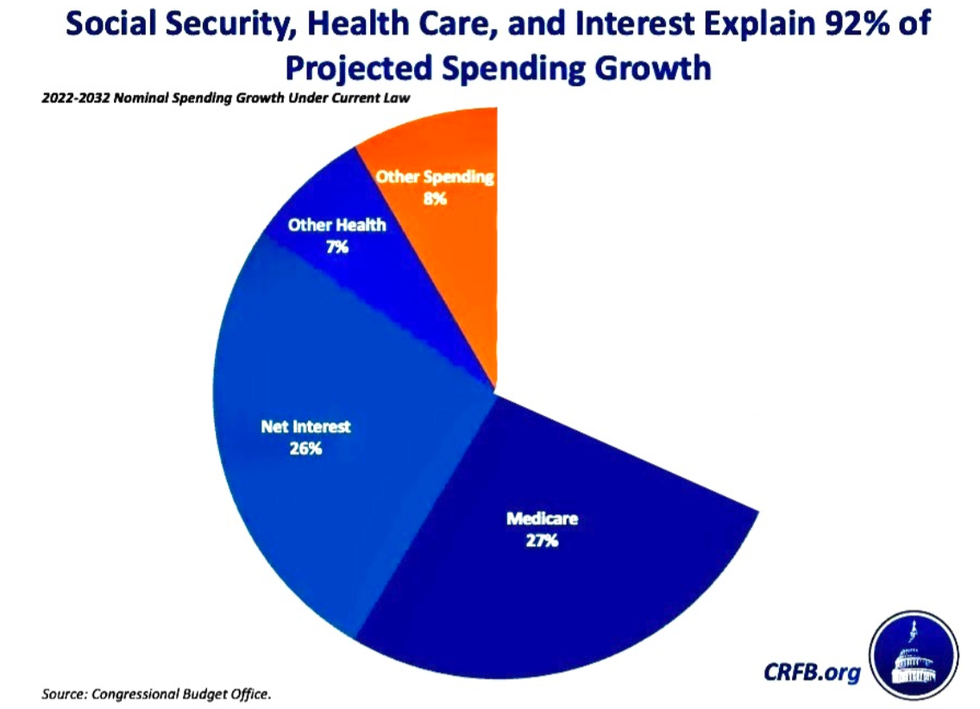
The chart overstates Medicare, too, since Medicare’s Hospital Insurance (Part A) is totally pre-funded, like Social Security, and its other parts are partially pre-funded.
Not surprisingly, the propagandists are trying to have it both ways. On the one hand, Social Security’s funding arrangement gives these groups the opportunity to frighten voters with talk about its projected future shortfall (which is easily fixed by taxing their billionaire funders.) “It’s going broke!” they say. “We won’t be able to pay benefits!”
At the same time, they put out charts and figures which ignore the requirement that benefits are paid only if there is sufficient revenue to cover their full cost. They perform that little act of misdirection so they can claim that Social Security contributes to federal government’s debt. Then they use that misinformation to call for—you guessed it—benefit cuts.
Heads, they win; tails, you lose.
As for Medicare, less than half of its costs (44 percent) are paid from general revenues. The rest comes from a dedicated payroll tax (36 percent), premiums paid by its beneficiaries (15 percent), and from interest and other sources. After adjusting for that, an honest chart of unfunded spending growth would look like this:
Looks a little less intimidating, doesn’t it?
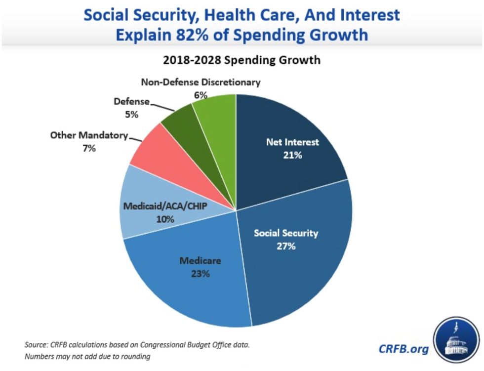
These groups often use their misdirection to minimize the vast amounts we spend on truly unproductive programs, especially our bloated military budget. This chart, also from CRFB and covering a different time period, makes that multi-trillion-dollar cost look almost minuscule:
But, again, an honest accounting gives us a very different picture:
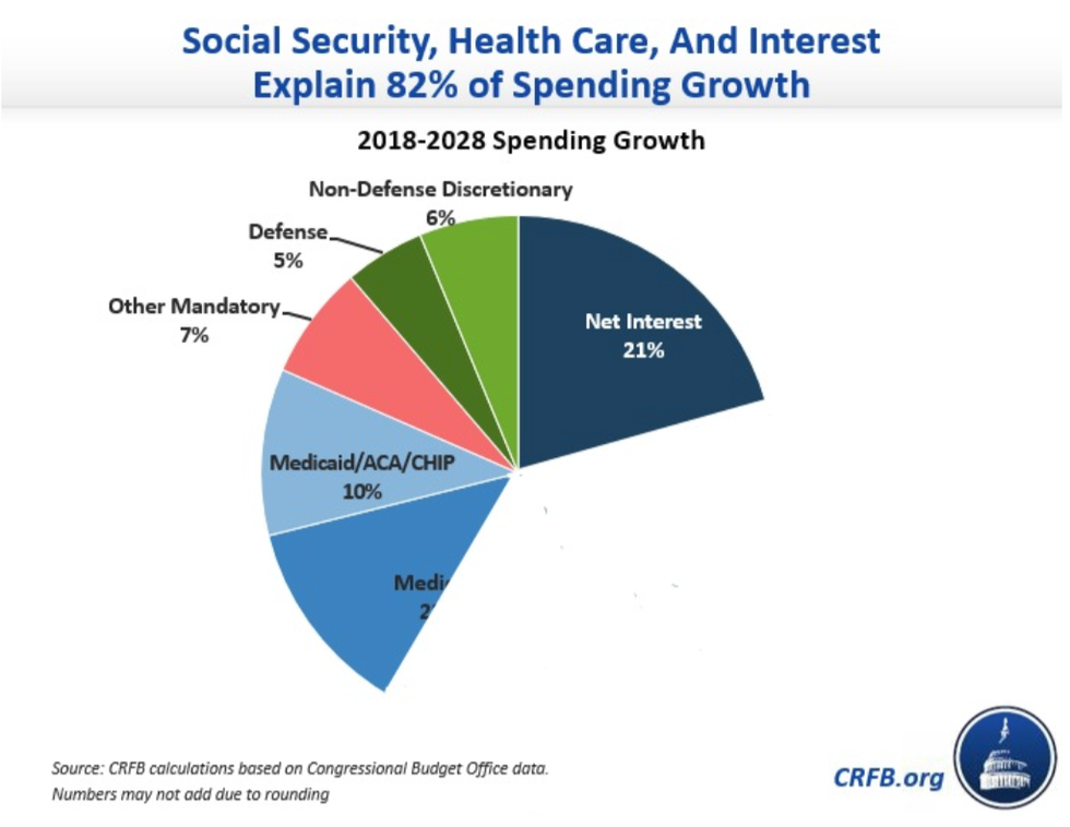
With an accurate chart, we can see that Medicare is less than one-fifth of (unfunded) spending growth (19.3 percent), while military spending is 8.1 percent. And, again, the figures are inherently skewed. Military spending has been growing unusually quickly, especially since Congress routinely gives the Pentagon more than the president has requested. This chart’s military spending category doesn’t seem to include the National Intelligence Directorate’s reported budget of $72.4 billion (much of its budget is classified). And it doesn’t include the cost of veterans’ care, which is budgeted at $325.1 billion for 2024, even though it should properly be classified as military spending. (Sadly, that seems consistent with a political culture that too often neglects veterans once they’re back home.)
We’re not really spending more than five times as much on Medicare as we are on the military, as they would have you believe; it’s not even close. What’s more, Medicare helps most working Americans at some point in their lives, which can’t be said for most of the Pentagon’s bloated and waste-filled budget.
The Center for a Responsible Federal Budget is not the only group working to eviscerate seniors’ benefits, of course, and pie charts are not the only visual format used to terrify policymakers and the public into submission. Another popular tactic is the long-long-long-term projection, where current trends are extrapolated to the stars and beyond. The Mercatus Center, for example, warned of a so-called “spending surge by seniors” by deploying this graph:
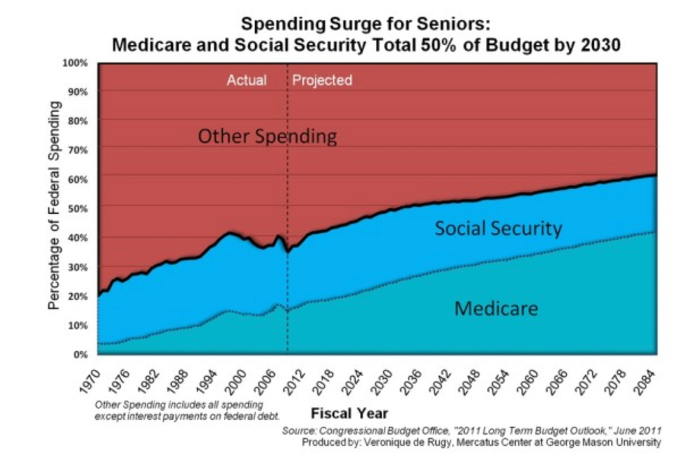
A picture is worth a thousand lies, especially when you’re projecting more than half a century into the future. And that title: “a spending surge for seniors”? A simple image search illustrates what surges look like in a variety of fields:

None of these sharp spikes resemble the 10- or 15-degree slope shown in the Mercatus graph. And, once again: these figures compare actuarial projections for these social programs with poorly informed guesswork about other forms of spending.
We could make the same kind of edits for the Mercatus graph we did for CRFB’s, but its sci-fi timeline makes that as pointless as the graph itself. After all, do you know how we’ll cope with the massive effects of climate change between now and 2084? Do you know how many pandemics we will endure? Do you know what technology will look like or how people will work, play, travel, and grow old as we approach the 22nd century?
No? Well, neither does the Mercatus Center. The purpose of these long timelines is to frighten people; nothing more.
Here are a few things they don’t usually tell you at these propaganda factories: that proposals in the House and Senate would expand Social Security benefits without adding a penny to unfunded spending. That reining in drug prices would reduce spending and save lives. That Medicare for All would reduce costs for everyone. That there are better ways to design a federal budget.
And, needless to say, they don’t mention the people who are impoverished or food-insecure in the wealthiest nation on Earth, a population that includes seniors and people with disabilities.
These, our vulnerable friends, family, and neighbors, will be gravely harmed if these billionaire-funded groups succeed in their mission.
The fiscal mendacity of these think tanks is perversely impressive. But their wealthy funders can’t hide the real reason they fund these fiscal fabulists and their confounding charts: they want to keep the biggest piece of the pie for themselves.
“There are three kinds of lies,” Mark Twain once said, “lies, damned lies, and statistics.” Today, there’s a fourth kind: pie charts.
A network of billionaire-funded propaganda organs has labored for decades to convince the public, politicians, and the media that Social Security and Medicare are financially unsustainable and must be slashed. These outfits are skilled at the art of number manipulation—so much so that this idea became inherited political wisdom for both parties.
Their cause has become less popular in recent years, but the mighty machine isn’t backing down. House Republicans are calling for another closed-door commission to explore cuts. “Liberal” newspapers still promote their falsehoods. And the usual suspects in the think-tank industry keep flooding the media zone with scary figures—and even scarier pictures—to frighten the public into submission. Oh, those pictures!
Take this one. It’s from the Committee for a Responsible Federal Budget, created by hedge fund billionaire and Nixon apparatchik Peter G. Peterson:
A glance at this chart could almost convince a person that we can’t afford Social Security and Medicare. But, even by the benchmarks of orthodox economics—the lingua franca of the policy class—it is deeply misleading.
First, it’s easy to overlook the fact that this chart doesn’t represent actual spending, but projected spending growth. That tilts the playing field, because Social Security’s actuaries are required to project its cost for decades to come—an exercise that is highly speculative. That’s not done for other kinds of expenditure.
Next, note that interest costs are lumped in with health care and Social Security. Why? There’s no logical reason to associate them, except for shock effect. Social Security never pays interest. It’s required by law to pay benefits from the money in its trust funds. In fact, it has lent trillions of dollars to the overall federal budget. That means some of the interest in this chart is being paid back to Social Security.
The US Treasury owes 9.2 percent of the federal government’s debt—some $2.8 trillion—to Social Security’s trust funds. The CRFB is double-counting this debt: first, by associating it with Social Security and healthcare, and then by leaving out the fact that this money is owed to Social Security itself. Until that debt is paid off, in the next ten years or so, the chart should look more like this:
They’re leaving out something else: Social Security is fully funded by its own dedicated revenue levied specifically for that purpose. If Social Security didn’t exist, that revenue would not be collected. The inverse is also true: if that revenue wasn’t collected, Social Security would not exist. Importantly, by law, those dedicated revenues can only be spent on Social Security benefits and their related administrative costs. This is not a complicated concept. Even Ronald Reagan tried to clear up the (likely willful) misunderstanding almost four decades ago.
If the chart reflected projected unfunded spending growth—which is the implication behind them, and is what the so-called deficit hawks claim to worry about—Social Security’s projected increase would drop to zero. Then the chart would look something like this:
The chart overstates Medicare, too, since Medicare’s Hospital Insurance (Part A) is totally pre-funded, like Social Security, and its other parts are partially pre-funded.
Not surprisingly, the propagandists are trying to have it both ways. On the one hand, Social Security’s funding arrangement gives these groups the opportunity to frighten voters with talk about its projected future shortfall (which is easily fixed by taxing their billionaire funders.) “It’s going broke!” they say. “We won’t be able to pay benefits!”
At the same time, they put out charts and figures which ignore the requirement that benefits are paid only if there is sufficient revenue to cover their full cost. They perform that little act of misdirection so they can claim that Social Security contributes to federal government’s debt. Then they use that misinformation to call for—you guessed it—benefit cuts.
Heads, they win; tails, you lose.
As for Medicare, less than half of its costs (44 percent) are paid from general revenues. The rest comes from a dedicated payroll tax (36 percent), premiums paid by its beneficiaries (15 percent), and from interest and other sources. After adjusting for that, an honest chart of unfunded spending growth would look like this:
Looks a little less intimidating, doesn’t it?
These groups often use their misdirection to minimize the vast amounts we spend on truly unproductive programs, especially our bloated military budget. This chart, also from CRFB and covering a different time period, makes that multi-trillion-dollar cost look almost minuscule:
But, again, an honest accounting gives us a very different picture:
With an accurate chart, we can see that Medicare is less than one-fifth of (unfunded) spending growth (19.3 percent), while military spending is 8.1 percent. And, again, the figures are inherently skewed. Military spending has been growing unusually quickly, especially since Congress routinely gives the Pentagon more than the president has requested. This chart’s military spending category doesn’t seem to include the National Intelligence Directorate’s reported budget of $72.4 billion (much of its budget is classified). And it doesn’t include the cost of veterans’ care, which is budgeted at $325.1 billion for 2024, even though it should properly be classified as military spending. (Sadly, that seems consistent with a political culture that too often neglects veterans once they’re back home.)
We’re not really spending more than five times as much on Medicare as we are on the military, as they would have you believe; it’s not even close. What’s more, Medicare helps most working Americans at some point in their lives, which can’t be said for most of the Pentagon’s bloated and waste-filled budget.
The Center for a Responsible Federal Budget is not the only group working to eviscerate seniors’ benefits, of course, and pie charts are not the only visual format used to terrify policymakers and the public into submission. Another popular tactic is the long-long-long-term projection, where current trends are extrapolated to the stars and beyond. The Mercatus Center, for example, warned of a so-called “spending surge by seniors” by deploying this graph:
A picture is worth a thousand lies, especially when you’re projecting more than half a century into the future. And that title: “a spending surge for seniors”? A simple image search illustrates what surges look like in a variety of fields:
None of these sharp spikes resemble the 10- or 15-degree slope shown in the Mercatus graph. And, once again: these figures compare actuarial projections for these social programs with poorly informed guesswork about other forms of spending.
We could make the same kind of edits for the Mercatus graph we did for CRFB’s, but its sci-fi timeline makes that as pointless as the graph itself. After all, do you know how we’ll cope with the massive effects of climate change between now and 2084? Do you know how many pandemics we will endure? Do you know what technology will look like or how people will work, play, travel, and grow old as we approach the 22nd century?
No? Well, neither does the Mercatus Center. The purpose of these long timelines is to frighten people; nothing more.
Here are a few things they don’t usually tell you at these propaganda factories: that proposals in the House and Senate would expand Social Security benefits without adding a penny to unfunded spending. That reining in drug prices would reduce spending and save lives. That Medicare for All would reduce costs for everyone. That there are better ways to design a federal budget.
And, needless to say, they don’t mention the people who are impoverished or food-insecure in the wealthiest nation on Earth, a population that includes seniors and people with disabilities.
These, our vulnerable friends, family, and neighbors, will be gravely harmed if these billionaire-funded groups succeed in their mission.
The fiscal mendacity of these think tanks is perversely impressive. But their wealthy funders can’t hide the real reason they fund these fiscal fabulists and their confounding charts: they want to keep the biggest piece of the pie for themselves.