

SUBSCRIBE TO OUR FREE NEWSLETTER
Daily news & progressive opinion—funded by the people, not the corporations—delivered straight to your inbox.
5
#000000
#FFFFFF
To donate by check, phone, or other method, see our More Ways to Give page.

The New York Times graphics department has done some great work translating the data of the Covid-19 pandemic into visual form, allowing readers to get an intuitive sense of the scope and course of the outbreak.
Their "Real Coronavirus Death Toll in Each State" (5/5/20) is not a good example of that great work.
It was a fine idea on paper: to provide a sense of the real human cost of the coronavirus outbreak by displaying, not the official count of Covid-19 deaths, but all the deaths above the average seasonal mortality average--what epidemiologists refer to as excess deaths. This would overcome the problem that, with deaths coming as fast as they are in many places, it's not possible to get an accurate count of those dying from the virus.
First, the Times presented the states "where deaths are far above normal":
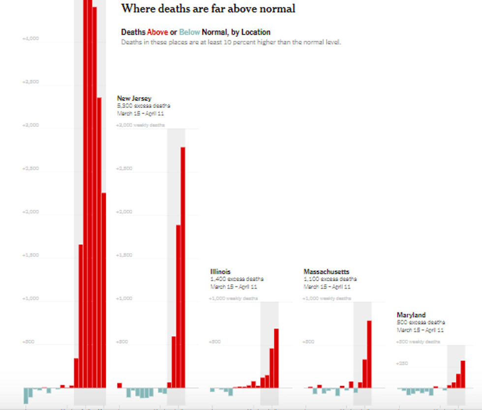
You can't help but notice that one locale--that's New York City--has far more excess deaths than anyplace else: 23,000 by the Times' count. That dwarfs the 5,300 in New Jersey, the 1,400 in Illinois, the 1,100 in Massachusetts and the 500 in Maryland. Colorado, Vermont and Wyoming have hardly any deaths to speak of, compared to New York City.
Then they go on to present the places "where deaths are slightly above normal"--less than 10% above expected deaths:
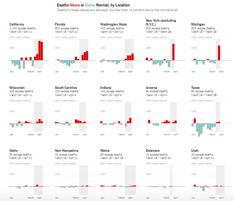
Sixteen states with, again, very few excess deaths in comparison to New York City--including high-population states like California, Texas and Florida. Even New York State, excluding New York City, has only 300 deaths.
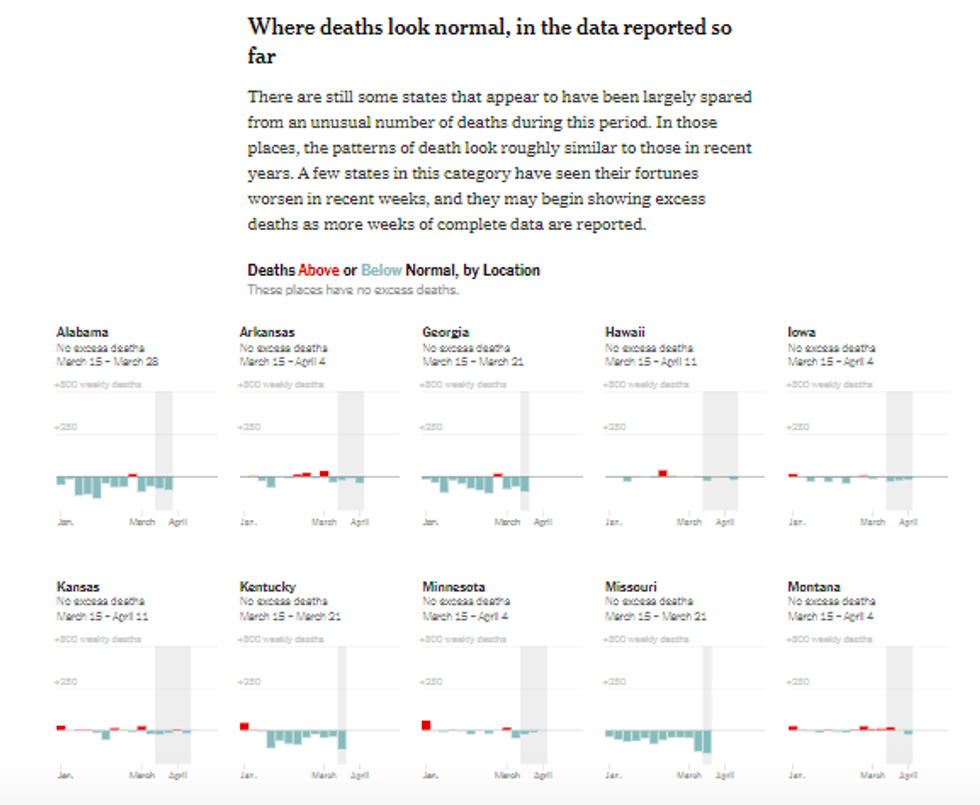
Then there are 17 other states (plus the District of Columbia) "where deaths look normal, in the data reported so far":
Looking at this New York Times feature as a whole, the clear message conveyed by the graphics is that New York City has a serious problem--and that virtually every state (including the rest of New York State) has, in comparison, no problem to speak of.
Only when you read the fine print do you realize that this impression is entirely misleading. Of course it appears as if the pandemic has hardly touched most states--because for the dates the Times has data for, the pandemic had hardly touched most states! (In reality, by May 2, New York City was the site of a little more than a quarter of all US Covid-19 deaths.)
The figures for excess deaths for New York City cover March 15-May 2, only a few days before the chart was published. The other "far above normal" states feature figures from March 15-April 11, or March 15-April 4--leaving out the three or four worst weeks of the pandemic. In the "slightly above normal" states, the time frames end on April 11, April 4 or March 28. In the places "where deaths look normal," the latest dates range from April 11 back to March 21. (Three states have "no reliable data for total deaths since March 15.")
Clearly, the New York Times designers used the most recent data they could get. But that just begs the question: Why didn't they postpone the project when they realized they didn't yet have the data they needed?
To give some idea of how distorting it is to compare death tolls separated by several weeks in an exponentially expanding viral outbreak, look at the reported Covid-19 death tolls on the day the Times' data stops for each state along with the death toll for those states on May 2, when its New York City data stops: Massachusetts, for example, was reporting 686 Covid-19 deaths on April 11, and 3,846--almost six times as many--on May 2. Michigan counted 111 deaths up through March 28, and 4,021 on May 2: 36 times more. Georgia's tally was 14 on March 21, 1,177 on May 2, representing an 84-fold increase.
Clearly using data with this kind of time bias produces a graphic that bears no relationship to reality. But the Times' write-up of the charts acts as though this information should be taken at face value:
In some states, the number of deaths so far looks roughly in line with those in a typical year, suggesting that the virus and its effects throughout medicine and society have not yet had a major impact on survival.
To be sure, the text goes on to note that "many states are weeks or months behind in reporting" and that "these state charts show death trends for slightly different time periods" (more accurately: entirely different time periods). But these are asides in an analysis that is itself meant to be ancillary to the main event, which is the charts themselves. If people can't look at a graphic and get a more-or-less accurate sense of the reality you mean to convey, then you've failed as a graphic designer.
And plenty of people looked at this feature and drew the obvious, incorrect conclusion. On Twitter, @Radxraymd (5/6/20) cited the Times' work while asking: "Why do so few states have excess deaths? Many have 'negative' excess deaths." @mitrebox (5/7/20) used the Times to announce, "Fun Fact: In Georgia, deaths are actually below normal." @varnergreg (5/7/20) pointed out: "In Alabama, deaths totals are actually below the historical trend. But look at NYC, 6x normal rate."
The right is already primed to use New York City as a scapegoat for the nation's coronavirus crisis. "There's a case to be made that New York City mayor Bill de Blasio is the single individual in the United States who is most to blame for the catastrophic loss of human life," declared Kyle Smith in National Review (4/27/20). The New York Times has provided the perfect illustration for the fantasy that the Times' own hometown is the unique focal point of coronavirus infection--all because its graphics department couldn't resist running with a clever idea that they didn't have the numbers to pull off.
ACTION ALERT: You can send a message to the New York Times at letters@nytimes.com (Twitter:@NYTimes). Please remember that respectful communication is the most effective. Feel free to leave a copy of your communication in the comments thread.
The New York Times graphics department has done some great work translating the data of the Covid-19 pandemic into visual form, allowing readers to get an intuitive sense of the scope and course of the outbreak.
Their "Real Coronavirus Death Toll in Each State" (5/5/20) is not a good example of that great work.
It was a fine idea on paper: to provide a sense of the real human cost of the coronavirus outbreak by displaying, not the official count of Covid-19 deaths, but all the deaths above the average seasonal mortality average--what epidemiologists refer to as excess deaths. This would overcome the problem that, with deaths coming as fast as they are in many places, it's not possible to get an accurate count of those dying from the virus.
First, the Times presented the states "where deaths are far above normal":
You can't help but notice that one locale--that's New York City--has far more excess deaths than anyplace else: 23,000 by the Times' count. That dwarfs the 5,300 in New Jersey, the 1,400 in Illinois, the 1,100 in Massachusetts and the 500 in Maryland. Colorado, Vermont and Wyoming have hardly any deaths to speak of, compared to New York City.
Then they go on to present the places "where deaths are slightly above normal"--less than 10% above expected deaths:
Sixteen states with, again, very few excess deaths in comparison to New York City--including high-population states like California, Texas and Florida. Even New York State, excluding New York City, has only 300 deaths.
Then there are 17 other states (plus the District of Columbia) "where deaths look normal, in the data reported so far":
Looking at this New York Times feature as a whole, the clear message conveyed by the graphics is that New York City has a serious problem--and that virtually every state (including the rest of New York State) has, in comparison, no problem to speak of.
Only when you read the fine print do you realize that this impression is entirely misleading. Of course it appears as if the pandemic has hardly touched most states--because for the dates the Times has data for, the pandemic had hardly touched most states! (In reality, by May 2, New York City was the site of a little more than a quarter of all US Covid-19 deaths.)
The figures for excess deaths for New York City cover March 15-May 2, only a few days before the chart was published. The other "far above normal" states feature figures from March 15-April 11, or March 15-April 4--leaving out the three or four worst weeks of the pandemic. In the "slightly above normal" states, the time frames end on April 11, April 4 or March 28. In the places "where deaths look normal," the latest dates range from April 11 back to March 21. (Three states have "no reliable data for total deaths since March 15.")
Clearly, the New York Times designers used the most recent data they could get. But that just begs the question: Why didn't they postpone the project when they realized they didn't yet have the data they needed?
To give some idea of how distorting it is to compare death tolls separated by several weeks in an exponentially expanding viral outbreak, look at the reported Covid-19 death tolls on the day the Times' data stops for each state along with the death toll for those states on May 2, when its New York City data stops: Massachusetts, for example, was reporting 686 Covid-19 deaths on April 11, and 3,846--almost six times as many--on May 2. Michigan counted 111 deaths up through March 28, and 4,021 on May 2: 36 times more. Georgia's tally was 14 on March 21, 1,177 on May 2, representing an 84-fold increase.
Clearly using data with this kind of time bias produces a graphic that bears no relationship to reality. But the Times' write-up of the charts acts as though this information should be taken at face value:
In some states, the number of deaths so far looks roughly in line with those in a typical year, suggesting that the virus and its effects throughout medicine and society have not yet had a major impact on survival.
To be sure, the text goes on to note that "many states are weeks or months behind in reporting" and that "these state charts show death trends for slightly different time periods" (more accurately: entirely different time periods). But these are asides in an analysis that is itself meant to be ancillary to the main event, which is the charts themselves. If people can't look at a graphic and get a more-or-less accurate sense of the reality you mean to convey, then you've failed as a graphic designer.
And plenty of people looked at this feature and drew the obvious, incorrect conclusion. On Twitter, @Radxraymd (5/6/20) cited the Times' work while asking: "Why do so few states have excess deaths? Many have 'negative' excess deaths." @mitrebox (5/7/20) used the Times to announce, "Fun Fact: In Georgia, deaths are actually below normal." @varnergreg (5/7/20) pointed out: "In Alabama, deaths totals are actually below the historical trend. But look at NYC, 6x normal rate."
The right is already primed to use New York City as a scapegoat for the nation's coronavirus crisis. "There's a case to be made that New York City mayor Bill de Blasio is the single individual in the United States who is most to blame for the catastrophic loss of human life," declared Kyle Smith in National Review (4/27/20). The New York Times has provided the perfect illustration for the fantasy that the Times' own hometown is the unique focal point of coronavirus infection--all because its graphics department couldn't resist running with a clever idea that they didn't have the numbers to pull off.
ACTION ALERT: You can send a message to the New York Times at letters@nytimes.com (Twitter:@NYTimes). Please remember that respectful communication is the most effective. Feel free to leave a copy of your communication in the comments thread.