

SUBSCRIBE TO OUR FREE NEWSLETTER
Daily news & progressive opinion—funded by the people, not the corporations—delivered straight to your inbox.
5
#000000
#FFFFFF
To donate by check, phone, or other method, see our More Ways to Give page.


Daily news & progressive opinion—funded by the people, not the corporations—delivered straight to your inbox.
Not long after I first came to Washington 20 years ago I was at a conference dealing with Social Security privatization. One of the panelists used a number for the administrative costs of private accounts that was far lower than the numbers I had seen in the literature. After the panel, I asked one of the other panelists about her best estimate of the administrative costs of private accounts. She said that this depended on whether I was interested in advocacy or policy.
I was somewhat taken aback by her response, but after a moment I told her that I was interested in accuracy. I have always felt that this is the best approach to policy questions.
Accuracy has not featured prominently in Washington budget debates in recent decades. There is an enormous amount of misunderstanding about the deficit, much of it deliberately promoted by politicians. We hear endless tales of out-of-control government spending and chronic deficits. This is nonsense as the data clearly show, but unfortunately both parties have an interest in promoting the deceptions.
There is a chart that I routinely use in presentations on the economy. It shows that the deficit was relatively small compared to GDP in the years prior to the economic collapse in 2008. The deficit in 2007 was just 1.2 percent of GDP, a level that we can sustain precisely forever. With deficits of this size, the ratio of debt to GDP is not rising, which means that there is no issue of debt sustainability.
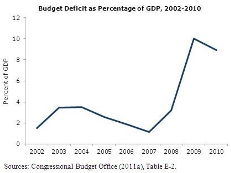
However that changes beginning in 2008 as shown clearly in the chart. The deficit jumps to 3.2 percent of GDP in fiscal of 2008 and then soars to 10.0 percent of GDP in fiscal 2009. The Republicans have used these numbers to blame the deficits on President Obama. However this ignores the inconvenient fact that the jump in the deficit preceded his taking office. (Remember these are fiscal years that begin on October 1 of the prior year. That means fiscal 2009 was almost one-third over the day that President Obama entered the White House.)
While President Obama's stimulus did increase the deficit by about 2 percentage points of GDP from its baseline level (while also creating around 2-3 million jobs) the main cause for the jump in the deficit was the economic downturn that followed from the collapse of the housing bubble. It was not wild spending that gave us big deficits the last three years; it was the economic wreckage that followed from the collapse of the housing bubble.
When the economy tanked, it sent tax collections plummeting. Similarly, the government began to pay out more money for unemployment benefits, food stamps and other transfer payments that automatically rise when the economy goes into a recession and people lose their jobs. In addition, the Obama administration also had its stimulus package to try to counteract the downturn, which increased the deficit by roughly 2 percent of GDP in both 2009 and 2010. These are the reasons that deficits always swell during a downturn, but the jump was especially large in the last few years because this downturn has been so much worse than past recessions.
It is easy to show that the story of deficits driven by out of control spending has no basis in reality, but it is also possible to show that Democrats' preferred tale of the deficit is also at odds with reality. Many Democrats and their allies are fond of charts like the one below showing actual and projected deficits from 2009 to 2019, and attributing the deficits to various causes.
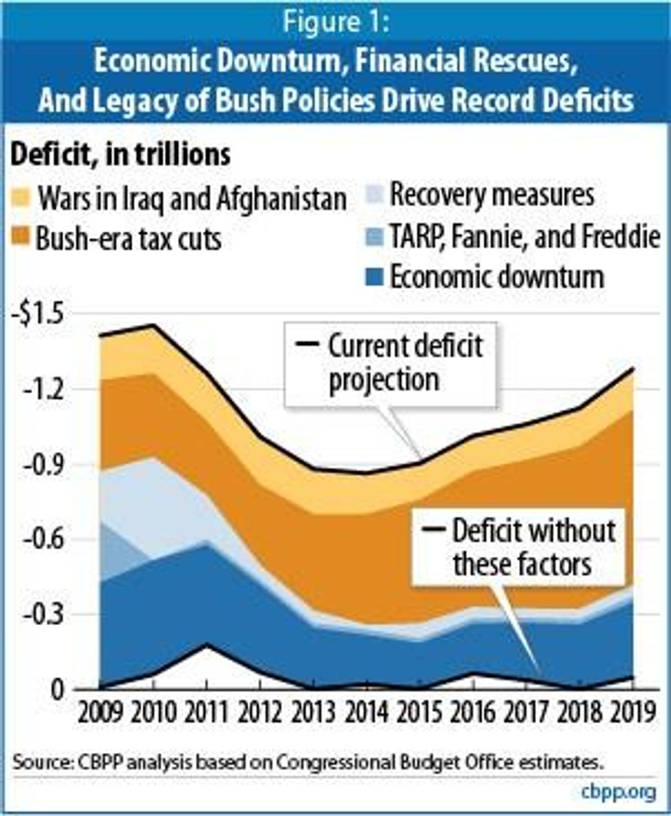
There are several aspects to this chart that are worth noting. First, starting the chart in 2009 can lead audiences to believe that large deficits had been an ongoing problem, rather than something that began with the recession. Second, the chart shows the deficit in nominal dollars rather than as shares of GDP. This is deceptive since GDP is projected to be nearly 60 percent higher at the end of the period in 2019 than it was in 2009. This means that measured as a share of GDP, the $1.2 trillion projected deficit shown for 2019 is only a bit more than half as large as the $1.4 trillion deficit that the country saw in 2009.
The deficit projected for 2019 is a bit more than 5.0 percent of GDP. That is a level that cannot be sustained indefinitely, but it is quite different from the deficits hovering near 10 percent of GDP that we have seen in the last three years.
The tale from this chart is that the Bush administration's tax cuts and the wars in Iraq and Afghanistan are the real culprits in the deficit story. While there are plenty of grounds for criticizing tax cuts that favored the wealthy and wars that we did need not to fight, the reality is that we would not be facing large deficits had it not been for the economic downturn caused by the collapse of the housing bubble. It is arguable that the deficits in the Bush years were larger than would have been desired (certainly the money could have been better directed), but the outsized deficits are directly attributable to the downturn. Furthermore, had it not been for the downturn, even if all the Bush tax cuts were left in place throughout the decade, the debt to GDP ratio would have increased only modestly over the decade.
In short, the real story of the deficit is the story of the economy, which is the problem of letting a housing bubble grow unchecked. The housing bubble was largely kept out of policy debates prior to the downturn, with the then-modest deficits getting far more attention in the media.
Remarkably, even after the collapse of the housing bubble has both wrecked the economy and led to large deficits, there is still little interest in the media in the underlying imbalances that led to the bubble. At the top of this list would be the over-valued dollar that led to large trade deficits. These trade deficits created a gap in demand that was filled by the stock bubble in the 90s and the housing bubble in the last decade.
But that discussion makes both the Clinton administration Democrats and the Bush administration Republicans look bad. As a result, we tend to get a lot more advocacy than accuracy in our policy debates about federal deficits and debt.
Donald Trump’s attacks on democracy, justice, and a free press are escalating — putting everything we stand for at risk. We believe a better world is possible, but we can’t get there without your support. Common Dreams stands apart. We answer only to you — our readers, activists, and changemakers — not to billionaires or corporations. Our independence allows us to cover the vital stories that others won’t, spotlighting movements for peace, equality, and human rights. Right now, our work faces unprecedented challenges. Misinformation is spreading, journalists are under attack, and financial pressures are mounting. As a reader-supported, nonprofit newsroom, your support is crucial to keep this journalism alive. Whatever you can give — $10, $25, or $100 — helps us stay strong and responsive when the world needs us most. Together, we’ll continue to build the independent, courageous journalism our movement relies on. Thank you for being part of this community. |
Not long after I first came to Washington 20 years ago I was at a conference dealing with Social Security privatization. One of the panelists used a number for the administrative costs of private accounts that was far lower than the numbers I had seen in the literature. After the panel, I asked one of the other panelists about her best estimate of the administrative costs of private accounts. She said that this depended on whether I was interested in advocacy or policy.
I was somewhat taken aback by her response, but after a moment I told her that I was interested in accuracy. I have always felt that this is the best approach to policy questions.
Accuracy has not featured prominently in Washington budget debates in recent decades. There is an enormous amount of misunderstanding about the deficit, much of it deliberately promoted by politicians. We hear endless tales of out-of-control government spending and chronic deficits. This is nonsense as the data clearly show, but unfortunately both parties have an interest in promoting the deceptions.
There is a chart that I routinely use in presentations on the economy. It shows that the deficit was relatively small compared to GDP in the years prior to the economic collapse in 2008. The deficit in 2007 was just 1.2 percent of GDP, a level that we can sustain precisely forever. With deficits of this size, the ratio of debt to GDP is not rising, which means that there is no issue of debt sustainability.

However that changes beginning in 2008 as shown clearly in the chart. The deficit jumps to 3.2 percent of GDP in fiscal of 2008 and then soars to 10.0 percent of GDP in fiscal 2009. The Republicans have used these numbers to blame the deficits on President Obama. However this ignores the inconvenient fact that the jump in the deficit preceded his taking office. (Remember these are fiscal years that begin on October 1 of the prior year. That means fiscal 2009 was almost one-third over the day that President Obama entered the White House.)
While President Obama's stimulus did increase the deficit by about 2 percentage points of GDP from its baseline level (while also creating around 2-3 million jobs) the main cause for the jump in the deficit was the economic downturn that followed from the collapse of the housing bubble. It was not wild spending that gave us big deficits the last three years; it was the economic wreckage that followed from the collapse of the housing bubble.
When the economy tanked, it sent tax collections plummeting. Similarly, the government began to pay out more money for unemployment benefits, food stamps and other transfer payments that automatically rise when the economy goes into a recession and people lose their jobs. In addition, the Obama administration also had its stimulus package to try to counteract the downturn, which increased the deficit by roughly 2 percent of GDP in both 2009 and 2010. These are the reasons that deficits always swell during a downturn, but the jump was especially large in the last few years because this downturn has been so much worse than past recessions.
It is easy to show that the story of deficits driven by out of control spending has no basis in reality, but it is also possible to show that Democrats' preferred tale of the deficit is also at odds with reality. Many Democrats and their allies are fond of charts like the one below showing actual and projected deficits from 2009 to 2019, and attributing the deficits to various causes.

There are several aspects to this chart that are worth noting. First, starting the chart in 2009 can lead audiences to believe that large deficits had been an ongoing problem, rather than something that began with the recession. Second, the chart shows the deficit in nominal dollars rather than as shares of GDP. This is deceptive since GDP is projected to be nearly 60 percent higher at the end of the period in 2019 than it was in 2009. This means that measured as a share of GDP, the $1.2 trillion projected deficit shown for 2019 is only a bit more than half as large as the $1.4 trillion deficit that the country saw in 2009.
The deficit projected for 2019 is a bit more than 5.0 percent of GDP. That is a level that cannot be sustained indefinitely, but it is quite different from the deficits hovering near 10 percent of GDP that we have seen in the last three years.
The tale from this chart is that the Bush administration's tax cuts and the wars in Iraq and Afghanistan are the real culprits in the deficit story. While there are plenty of grounds for criticizing tax cuts that favored the wealthy and wars that we did need not to fight, the reality is that we would not be facing large deficits had it not been for the economic downturn caused by the collapse of the housing bubble. It is arguable that the deficits in the Bush years were larger than would have been desired (certainly the money could have been better directed), but the outsized deficits are directly attributable to the downturn. Furthermore, had it not been for the downturn, even if all the Bush tax cuts were left in place throughout the decade, the debt to GDP ratio would have increased only modestly over the decade.
In short, the real story of the deficit is the story of the economy, which is the problem of letting a housing bubble grow unchecked. The housing bubble was largely kept out of policy debates prior to the downturn, with the then-modest deficits getting far more attention in the media.
Remarkably, even after the collapse of the housing bubble has both wrecked the economy and led to large deficits, there is still little interest in the media in the underlying imbalances that led to the bubble. At the top of this list would be the over-valued dollar that led to large trade deficits. These trade deficits created a gap in demand that was filled by the stock bubble in the 90s and the housing bubble in the last decade.
But that discussion makes both the Clinton administration Democrats and the Bush administration Republicans look bad. As a result, we tend to get a lot more advocacy than accuracy in our policy debates about federal deficits and debt.
Not long after I first came to Washington 20 years ago I was at a conference dealing with Social Security privatization. One of the panelists used a number for the administrative costs of private accounts that was far lower than the numbers I had seen in the literature. After the panel, I asked one of the other panelists about her best estimate of the administrative costs of private accounts. She said that this depended on whether I was interested in advocacy or policy.
I was somewhat taken aback by her response, but after a moment I told her that I was interested in accuracy. I have always felt that this is the best approach to policy questions.
Accuracy has not featured prominently in Washington budget debates in recent decades. There is an enormous amount of misunderstanding about the deficit, much of it deliberately promoted by politicians. We hear endless tales of out-of-control government spending and chronic deficits. This is nonsense as the data clearly show, but unfortunately both parties have an interest in promoting the deceptions.
There is a chart that I routinely use in presentations on the economy. It shows that the deficit was relatively small compared to GDP in the years prior to the economic collapse in 2008. The deficit in 2007 was just 1.2 percent of GDP, a level that we can sustain precisely forever. With deficits of this size, the ratio of debt to GDP is not rising, which means that there is no issue of debt sustainability.

However that changes beginning in 2008 as shown clearly in the chart. The deficit jumps to 3.2 percent of GDP in fiscal of 2008 and then soars to 10.0 percent of GDP in fiscal 2009. The Republicans have used these numbers to blame the deficits on President Obama. However this ignores the inconvenient fact that the jump in the deficit preceded his taking office. (Remember these are fiscal years that begin on October 1 of the prior year. That means fiscal 2009 was almost one-third over the day that President Obama entered the White House.)
While President Obama's stimulus did increase the deficit by about 2 percentage points of GDP from its baseline level (while also creating around 2-3 million jobs) the main cause for the jump in the deficit was the economic downturn that followed from the collapse of the housing bubble. It was not wild spending that gave us big deficits the last three years; it was the economic wreckage that followed from the collapse of the housing bubble.
When the economy tanked, it sent tax collections plummeting. Similarly, the government began to pay out more money for unemployment benefits, food stamps and other transfer payments that automatically rise when the economy goes into a recession and people lose their jobs. In addition, the Obama administration also had its stimulus package to try to counteract the downturn, which increased the deficit by roughly 2 percent of GDP in both 2009 and 2010. These are the reasons that deficits always swell during a downturn, but the jump was especially large in the last few years because this downturn has been so much worse than past recessions.
It is easy to show that the story of deficits driven by out of control spending has no basis in reality, but it is also possible to show that Democrats' preferred tale of the deficit is also at odds with reality. Many Democrats and their allies are fond of charts like the one below showing actual and projected deficits from 2009 to 2019, and attributing the deficits to various causes.

There are several aspects to this chart that are worth noting. First, starting the chart in 2009 can lead audiences to believe that large deficits had been an ongoing problem, rather than something that began with the recession. Second, the chart shows the deficit in nominal dollars rather than as shares of GDP. This is deceptive since GDP is projected to be nearly 60 percent higher at the end of the period in 2019 than it was in 2009. This means that measured as a share of GDP, the $1.2 trillion projected deficit shown for 2019 is only a bit more than half as large as the $1.4 trillion deficit that the country saw in 2009.
The deficit projected for 2019 is a bit more than 5.0 percent of GDP. That is a level that cannot be sustained indefinitely, but it is quite different from the deficits hovering near 10 percent of GDP that we have seen in the last three years.
The tale from this chart is that the Bush administration's tax cuts and the wars in Iraq and Afghanistan are the real culprits in the deficit story. While there are plenty of grounds for criticizing tax cuts that favored the wealthy and wars that we did need not to fight, the reality is that we would not be facing large deficits had it not been for the economic downturn caused by the collapse of the housing bubble. It is arguable that the deficits in the Bush years were larger than would have been desired (certainly the money could have been better directed), but the outsized deficits are directly attributable to the downturn. Furthermore, had it not been for the downturn, even if all the Bush tax cuts were left in place throughout the decade, the debt to GDP ratio would have increased only modestly over the decade.
In short, the real story of the deficit is the story of the economy, which is the problem of letting a housing bubble grow unchecked. The housing bubble was largely kept out of policy debates prior to the downturn, with the then-modest deficits getting far more attention in the media.
Remarkably, even after the collapse of the housing bubble has both wrecked the economy and led to large deficits, there is still little interest in the media in the underlying imbalances that led to the bubble. At the top of this list would be the over-valued dollar that led to large trade deficits. These trade deficits created a gap in demand that was filled by the stock bubble in the 90s and the housing bubble in the last decade.
But that discussion makes both the Clinton administration Democrats and the Bush administration Republicans look bad. As a result, we tend to get a lot more advocacy than accuracy in our policy debates about federal deficits and debt.